
Switzerland is a country with a wealth of ancestral know-how passed down from generation to generation; discover our talented winemakers.
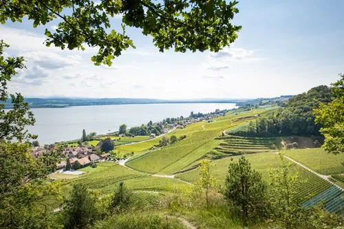
Swiss vineyards displays a unique variety in the world: an alpine landscape, a different climate depending on the region, and unique grape varieties.

Swiss vineyards cover 14,696 hectares, with more than 2,500 winemakers in six regions: Valais, Vaud, German-speaking Switzerland, Geneva, Ticino and the Three Lakes.
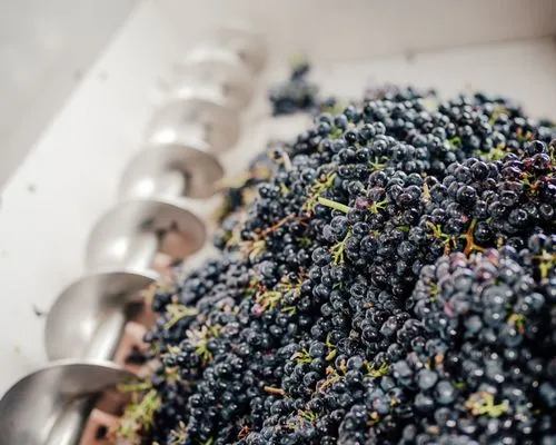
Switzerland's particular landscape and its vineyards inspire viticulture on a human scale, where the winemaker's skills remain the essential tool to bring grapes to maturity.
About us
[]
Swiss Wine Promotion
Putting Swiss wines in the spotlight – that, in a nutshell, is the mission of Swiss Wine Promotion (SWP). SWP is the national promotion body for Swiss wines and is tasked by the Interprofession de la Vigne et des Vins Suisses (IVVS) with enhancing the image of Swiss wine at home and abroad. SWP develops and implements marketing, communication, public relations and image promotion strategies.
SWP's activities help to position Swiss wine as a product with high added value and to promote value creation throughout the wine industry. SWP promotes the age-old traditions, know-how, and diversity of the six wine-growing regions. To this end, SWP communicates under the Swiss Wine brand.
The team
Different profiles and personalities, but all driven by the same passions: highlighting the age-old traditions, know-how and diversity of our vineyards, our country's cultural heritage and, of course, promoting Swiss wines.
Nicolas Joss
Director
Océane Gex
Deputy Director
Jasmin Schmid
Project Manager, Gastronomy & Export
Sidonie Gerber
Project Manager, Tourism & Retail
Marine Bréhonnet
Head of Communications
Bisera Mitrevski
Marketing and Communications Coordinator
Carmen Stalder
Communication Coordinator
Fiona Vaucher
Gastronomy and Export Project Coordinator
Nuria Marcantonio
Gastronomy and Export Project Coordinator
Catherine Champion
Administrative Assistant
Béatrice Patthey
Accounting Assistant
To visit our site, you must be of legal drinking age in your country of residence.